Choose a quieter color story
Separate ink choices from the paper beneath them.
Make one quiet palette and one brighter variation without repainting. The six ink slots are linked to the marks that use them; the background is a separate color.
A result you can build toward
These are actual outputs of the studio’s drawing and repeat functions. They are reference compositions, not screenshots of physical products. Your hand-drawn marks will vary.
Download the reference tile ↓The download is the first example’s repeating unit, not the full preview. It opens in SVG-compatible applications; the studio does not import files.
01 / Set up your drawing
Assign ink 1 #345B45, ink 2 #BD704E, and ink 3 #E5B65D. Keep the other three slots available rather than forcing all six colors into one piece. Set the background to #FAF8F1. Draw a larger group with ink 1 and smaller accents with inks 2 and 3.
02 / Make the example
Select ink 1, open Edit color, and change it to #557D9B with the hex field. Every mark painted with that slot changes together, even if it was drawn earlier. Marks painted with another slot stay as they were. Two slots can hold the same hex value and still remain independent; slot identity controls recoloring, not visual similarity.
03 / Compare and refine
Use the wheel to explore hue and saturation, then adjust brightness separately. Near the center of the wheel the color is less saturated; farther out it is stronger. A low brightness value can make very different hues look nearly black. Compare a blue-and-ochre version with the green-and-terracotta starting point while keeping the drawing unchanged.
If the result feels off
If several marks change when you intended to change just one, they share an ink slot. Undo restores the earlier palette, but the studio does not select and reassign individual marks after drawing. For future marks choose another slot first. If your accents disappear against the paper, adjust brightness to create a clearer light-dark difference rather than adding more colors.
Check the finished file
Download each variation before making the next. A practical palette can use one dominant ink, one supporting ink, and a tiny accent; six available slots are a limit, not a target. Check the exported pattern at its intended size, because small pale marks can disappear even when they look clear in an enlarged preview.
Visual inspiration
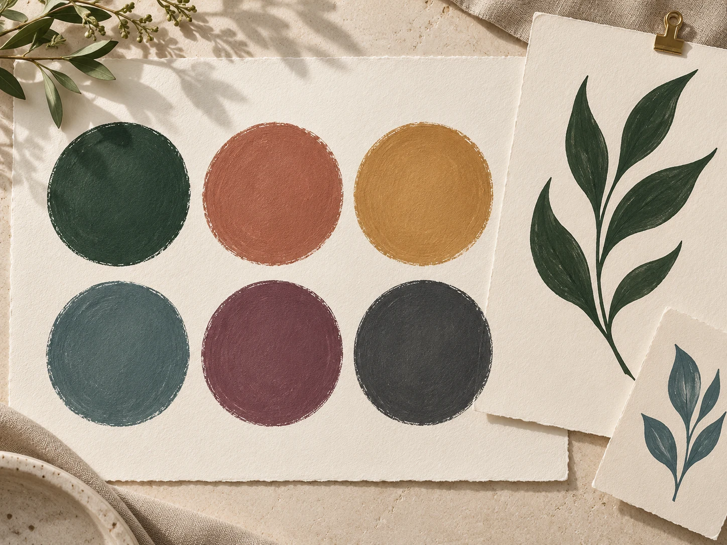
This AI-generated editorial image is a separate styling idea. Follow the studio-rendered examples above for achievable tool output. Physical materials and printing need your own tests.