Give your marks a different backdrop
Use one familiar color wheel for both ink and background.
Use the paper color as an active part of the palette. The background is independent of the six ink slots and uses the same wheel, brightness control, and hex input.
A result you can build toward
These are actual outputs of the studio’s drawing and repeat functions. They are reference compositions, not screenshots of physical products. Your hand-drawn marks will vary.
Download the reference tile ↓The download is the first example’s repeating unit, not the full preview. It opens in SVG-compatible applications; the studio does not import files.
01 / Set up your drawing
Make a small drawing with dark green #345B45 and terracotta #BD704E. Start with background #FAF8F1 and Transparent turned off. Keep offset and pattern rotation at 0° while comparing colors, so the composition stays constant.
02 / Make the example
Open the background color control rather than Edit color for an ink slot. Try #F0E8DF for warm paper, then #E4EBDD for a cooler pale green. Select an ink swatch again when you want to change drawing color. Choosing a background does not change which ink slot was used for existing marks.
03 / Compare and refine
Now try a dark background #30352F. Dark green marks will be hard to see, so recolor their ink slot to a light cream. Compare Marker and Pen on the dark surface: the translucent brush can blend into it, while Pen stays more solid. Work on the background and dominant ink together rather than judging either color in isolation.
If the result feels off
If changing the background appears to do nothing, check whether Transparent is enabled. When transparency is on, the exported background is omitted. If a mark seems to disappear, test its brightness and brush opacity before drawing over it. Darkening the background is not the same as changing the ink; use the correct editor target for each.
Check the finished file
Export light-paper and dark-paper versions separately, then compare them at a small thumbnail size. Choose the one that keeps the important shapes legible without making every accent equally strong. For printing, remember that an opaque pale background can use ink across the whole sheet. A transparent export on colored paper may be a better starting point, subject to your print process.
Visual inspiration
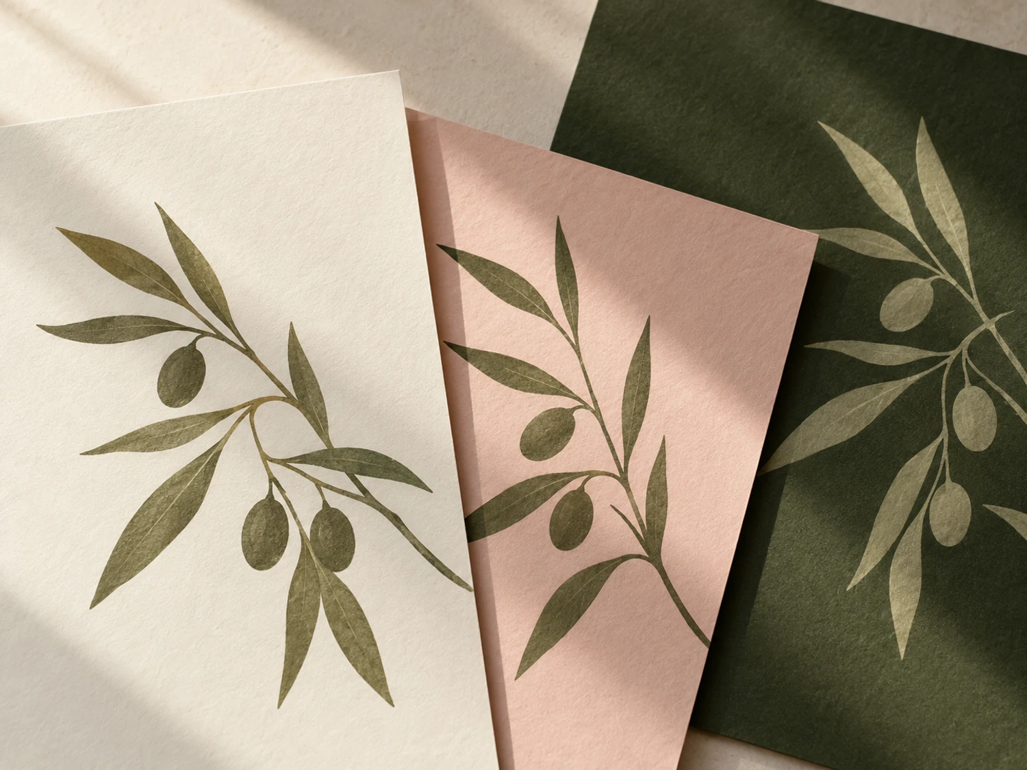
This AI-generated editorial image is a separate styling idea. Follow the studio-rendered examples above for achievable tool output. Physical materials and printing need your own tests.