A cover with your own handwriting
Make a repeating surface, then add a quiet title.
Build a personal patterned cover with a quiet place for a title. Keyagain makes the repeat; the title, spine, and final cover dimensions are assembled in a layout application.
A result you can build toward
These are actual outputs of the studio’s drawing and repeat functions. They are reference compositions, not screenshots of physical products. Your hand-drawn marks will vary.
Download the reference tile ↓The download is the first example’s repeating unit, not the full preview. It opens in SVG-compatible applications; the studio does not import files.
A front-cover layout study
This digital composition is assembled from the reference artwork. It demonstrates the next layout step; it is not a photograph or a physical production test.
Download the layout study SVG ↓01 / Set up your drawing
Try Arch stamps in #557D9B with smaller Pen accents in #30352F on #F0E8DF. Use size 24 for arches and size 5 for strokes. Start at offset 0%, scale 80%, and Pattern rotation 0°. Draw a loose arrangement rather than lining every arch up perfectly.
02 / Make the example
Place three arches at different heights and add one or two short accents. Export SVG or a large PNG. In a layout application, create a page using your actual notebook measurements. For a simple front panel, use the front cover width and height. A wraparound design also needs the back, spine, and any flap allowance; measure those rather than assuming a generic template.
03 / Compare and refine
Repeat the tile across the cover and place a solid light rectangle above it for a title label. Add text in the layout application, not the studio. Try a small label in the lower third and a larger centered label. Keep enough space around the type that the pattern does not compete with the words, especially when the notebook is seen from a distance.
If the result feels off
If the title becomes hard to read, increase the label's opaque area instead of only making the lettering darker. If important motifs fall awkwardly at the trim edge, shift the pattern in the layout rather than distorting its tile. Keep offset exports in their original proportions. Ask your printer for bleed and safe-area requirements if the artwork is being professionally trimmed.
Check the finished file
Print a paper mockup at actual size and wrap it around the notebook before choosing a durable cover material or adhesive. Check the spine and fold positions with the notebook closed. The digital reference below demonstrates the repeat, not a ready-to-print fitted book jacket. Save the measured layout separately from the pattern so the next notebook can use different dimensions.
Visual inspiration
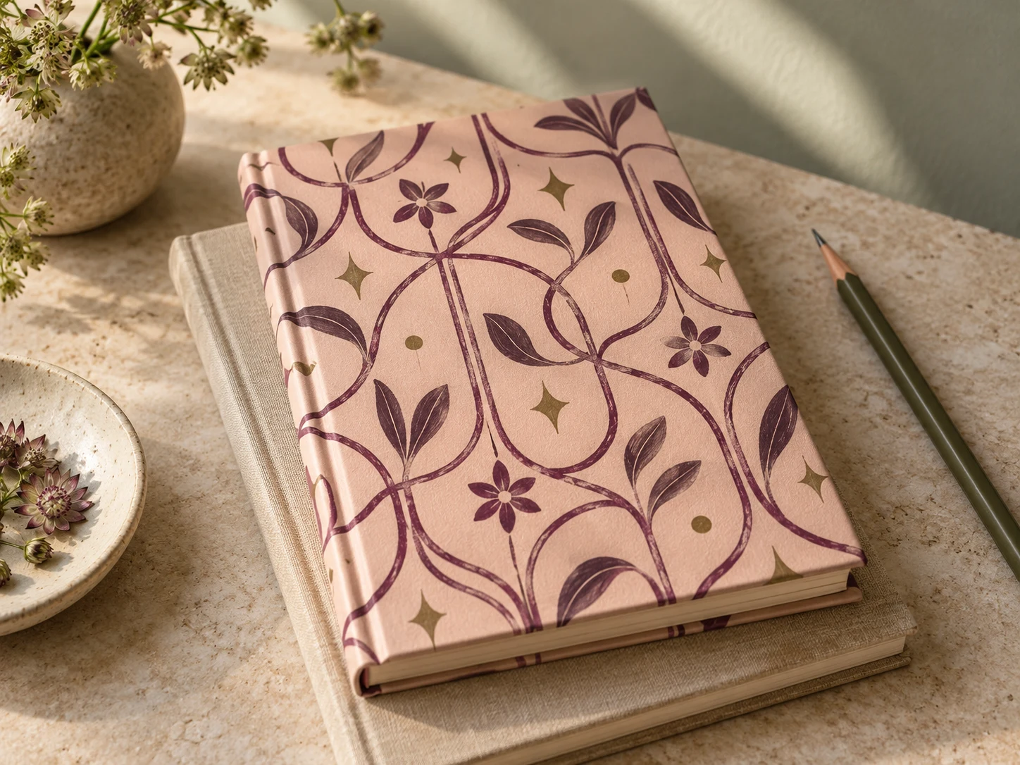
This AI-generated editorial image is a separate styling idea. Follow the studio-rendered examples above for achievable tool output. Physical materials and printing need your own tests.